
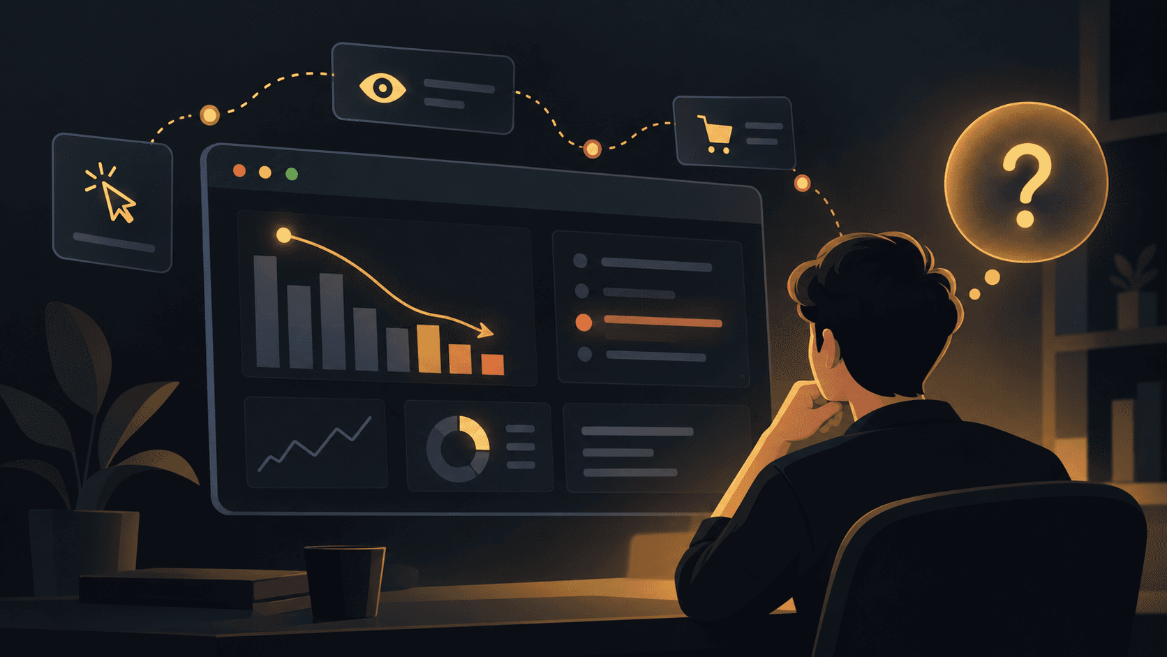
A pricing visit is a decision in progress
Someone who reaches pricing is often comparing value, risk, and fit. Leaving does not always mean the price was too high; the page may simply have left an important question unanswered.
Repeated plan comparisons, visits to the FAQ, and pauses around feature limits can tell you which parts of the decision need clearer guidance.
It helps to remember that a pricing page rarely closes a sale by itself. It usually confirms or removes doubt that built up during the rest of the visit, which means friction on this page often has roots elsewhere in the journey.
Treating every pricing-page exit as a single category of loss hides the fact that different visitors are stuck on different questions, and a single fix will rarely help all of them equally.
Common sources of pricing-page uncertainty
Ambiguous plan boundaries are one of the most frequent sources of hesitation, particularly when it is unclear what happens after a usage limit is reached or a trial period ends.
Feature comparisons that require scrolling back and forth between columns add real cognitive load, and visitors who repeatedly compare the same two features are often silently asking whether the cheaper plan is 'good enough.'
Unclear cancellation, refund, or downgrade policies create risk that many visitors are unwilling to accept without reading the fine print, which shows up as time spent on FAQ or terms pages before an exit.
Currency, tax, or regional pricing confusion can also quietly derail a decision, especially for visitors comparing costs against a budget in a different currency than the one displayed.
Make the next step easier to trust
Clear plan differences, honest limits, and answers to common objections help visitors decide with confidence. The goal is not to push every visitor toward a button; it is to remove avoidable uncertainty.
Look at the journeys around pricing-page exits, group recurring questions, and improve the explanations that matter most.
Small changes often have outsized effects here: a single sentence clarifying what happens at a usage limit, or a tooltip explaining a confusing feature name, can resolve the exact hesitation a large share of visitors are experiencing.
It is worth testing these changes individually rather than redesigning the whole page at once, since a full redesign makes it much harder to know which change actually reduced the uncertainty.
Turning pricing friction into a repeatable process
The most effective teams treat the pricing page as a living document, reviewed regularly against the actual questions visitors are getting stuck on, rather than a page that is finished once it ships.
This means building a habit of checking which sections of the page draw repeated attention, which comparisons visitors make most often, and which objections keep resurfacing across different segments of traffic.
It also means coordinating with sales and support teams, since the questions a sales call answers are often the same ones a visitor was quietly stuck on moments before they left the page unconverted.
Over time, this turns the pricing page from a static list of numbers into one of the most carefully tuned pages on the site, precisely because it sits at the exact moment a decision is being made.